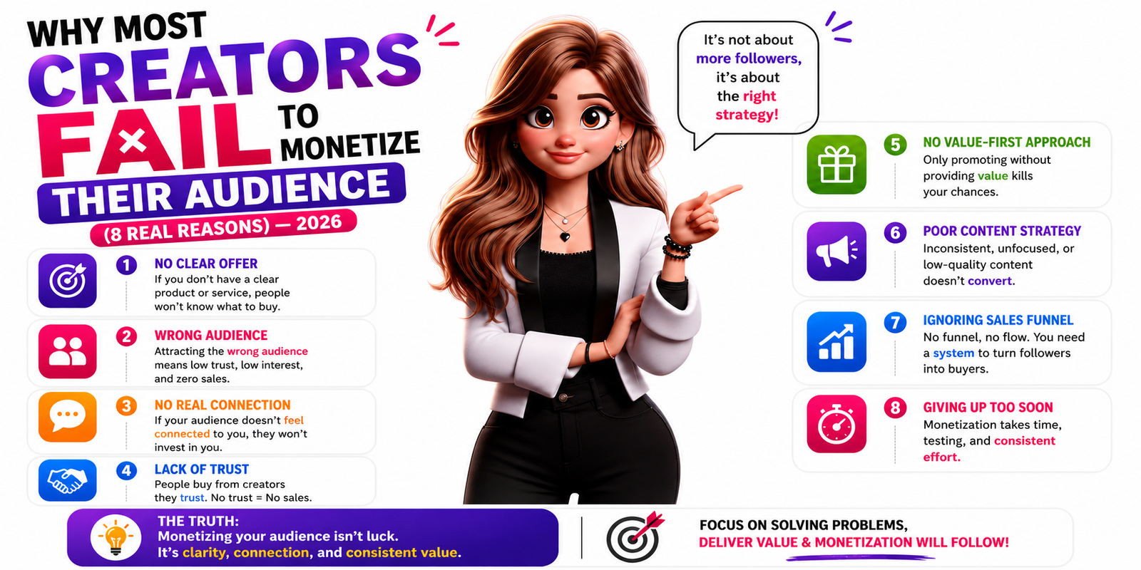
90% of creators with 10K+ followers earn almost nothing. Here are the 8 real structural reasons — with before/after examples and the exact monetization system that fixes all of them. Free to implement today.
The Psychology Breakdown
8 Psychological Principles That Determine Whether Your Page Converts
Every creator page either applies these principles deliberately — or fails because it doesn't. Here's the science behind each one, and what it means for your conversion rate.
First Impression Psychology — The 100ms Window
Research published in Behaviour & Information Technology found that users form a visual impression of a webpage in as little as 50–100 milliseconds — faster than conscious thought. In that window, they're not reading anything. They're absorbing visual complexity, color, layout density, and overall professionalism as a single feeling: trustworthy or not.
A creator page cluttered with too many links, inconsistent fonts, and no clear visual hierarchy fails this test instantly. A clean, focused, fast-loading page passes it — and earns the 7 seconds of actual attention that follows.
Attention Science — The 8-Second Filter
You have approximately 8 seconds to answer a visitor's single most important question: "Is this for me?" If your page doesn't answer that question clearly within 8 seconds — with your value proposition, your offer, and who you serve — the visitor leaves. Not because they're not interested. Because you made them work too hard to find out if they should be.
The highest-converting creator pages answer this in the above-the-fold section: one headline that says exactly what you offer, one subheadline that says who it's for, and one CTA that says what to do next. No scrolling required to understand the entire value proposition.
Trust Signal Architecture — The Credibility Stack
Before any visitor converts, they ask themselves: "Can I trust this person?" Trust is not assumed — it's built through a specific stack of signals. Social proof (follower count, testimonials), consistency signals (professional photo, consistent branding), transparency signals (clear pricing, no hidden conditions), and authority signals (press mentions, certifications, client results).
The absence of trust signals doesn't mean visitors think you're untrustworthy. It means they have to work to decide — and most don't bother. Every missing trust element is a conversion leak. Fill each one deliberately.
CTA Placement Strategy — Fitts's Law in Practice
Fitts's Law from UX research states that the time to hit a target is a function of its distance and size. On a mobile screen, a CTA button that's too small, too far from the primary content, or hidden below unnecessary information is a physically harder action to complete — and humans unconsciously avoid hard actions.
On a creator page: your primary CTA should be the largest, most visually dominant element. Immediately visible on mobile without scrolling. Use action language ("Get My Free Guide") not passive language ("Click Here").
Color Psychology — The Emotional Pre-Frame
Color communicates before language. Before a visitor reads a single word, the dominant color palette has already established a mood: professional or casual, trustworthy or exciting, premium or accessible. Blue conveys trust. Orange and yellow drive urgency. Green signals growth. Pink and purple signal creativity and personality.
The biggest color mistake: using default template colors with no deliberate brand intention. If your palette isn't a conscious choice that reinforces your positioning, it's communicating something you don't intend.
Mobile Conversion Behavior — Thumb Zone Science
68% of bio link conversions happen on mobile. Mobile users interact primarily using their thumbs, and UX researchers have mapped the "thumb zone" — the area naturally reachable without shifting grip. The bottom two-thirds of the screen center is the natural thumb strike zone.
Creator pages optimised for mobile place their primary CTA within the natural thumb zone, use touch-friendly button sizes (minimum 44×44px), avoid hover-dependent interactions, and load in under 2 seconds on 4G.
Why Simplicity Converts Better — Cognitive Load Theory
Cognitive Load Theory, developed by John Sweller, explains why simpler pages consistently outperform content-rich ones: every visual element on a page consumes working memory. When working memory is overwhelmed by too many choices, options, links, or competing focal points — the brain defaults to the lowest-effort response: doing nothing.
This is why a creator page with 2 carefully chosen links converts better than one with 8. Not because there's less to offer, but because 2 choices don't overwhelm the visitor's decision-making capacity. Simplicity isn't a design preference. It's a conversion strategy.
The "One Link" Conversion Strategy — Single Path, Maximum Focus
The highest-converting creator pages are built around a single primary conversion action. Not "buy this, or sign up for this, or watch this, or message me, or follow me on YouTube." One thing. The visitor who arrives from a specific piece of content has a specific intent — and a page that serves exactly that intent, without distraction, converts at 3–5× the rate of a multi-option page.
This is the "one link" strategy: your Instagram bio link points to a page specifically designed to convert for your current primary goal — whether that's capturing an email, selling a product, or starting a WhatsApp conversation. Everything else is secondary, visually subordinate, or removed entirely.
What High-Converting Pages Have
The 6 Elements That Separate Converting Pages from the Rest
These aren't optional extras. Each one directly addresses one of the 8 psychological principles above — and each one is built into every Linqin.in page by default.
